Work
Thoughtfully designed and expertly built digital solutions

Website

Website
Website
Website
Software design

Interactive Kiosk

Website

Website
Website
Website
Website
Website
Website
Website
Website

Website and Interactive Kiosks
Website
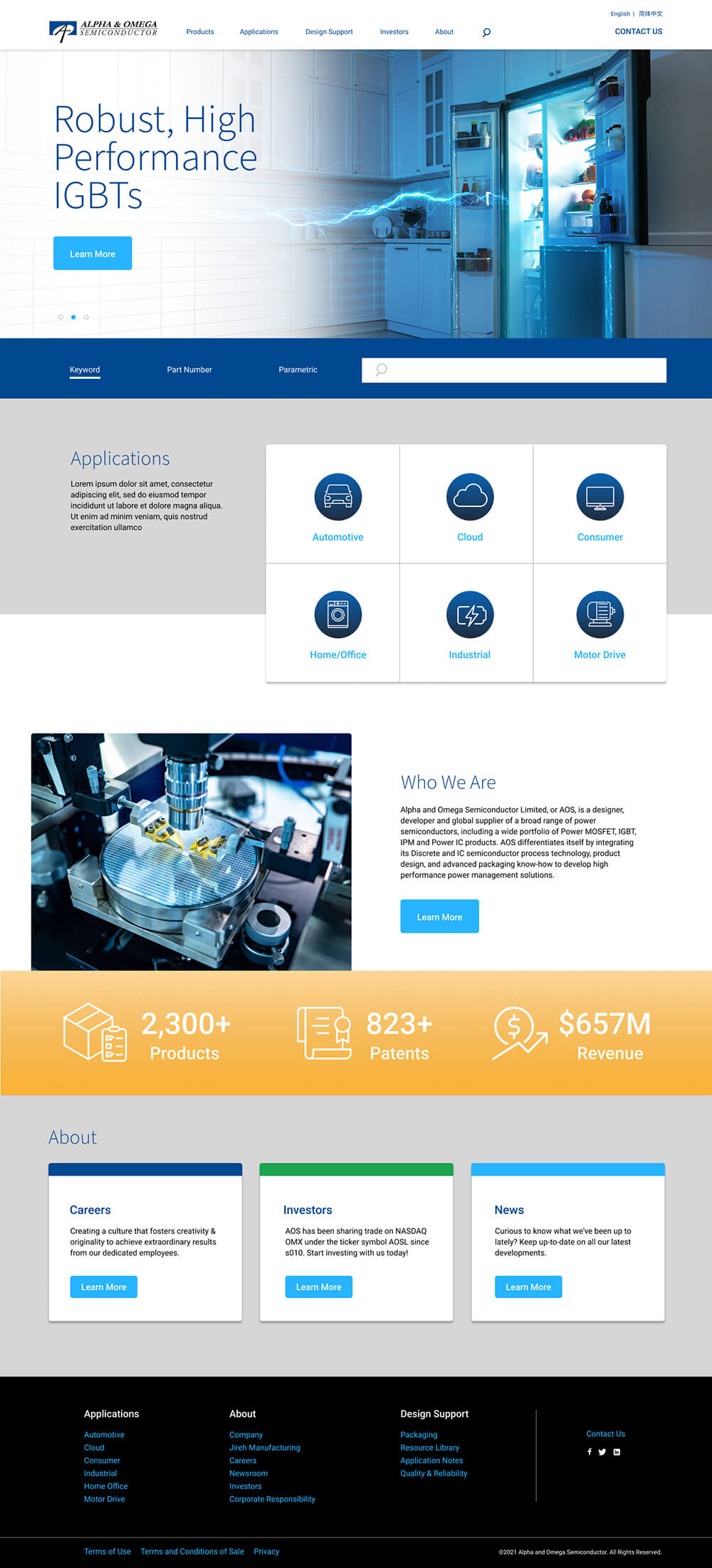
AOS’s previous website no longer reflected the company’s position as a leader in the power semiconductor industry and they were in need of a refresh. An outdated content management platform and lack of intuitive product locator tools frustrated both employees and potential customers.
Integration with an existing ERP, robust and intuitive content management capabilities, and a contemporary, responsive user interface were requirements for success in a new website.
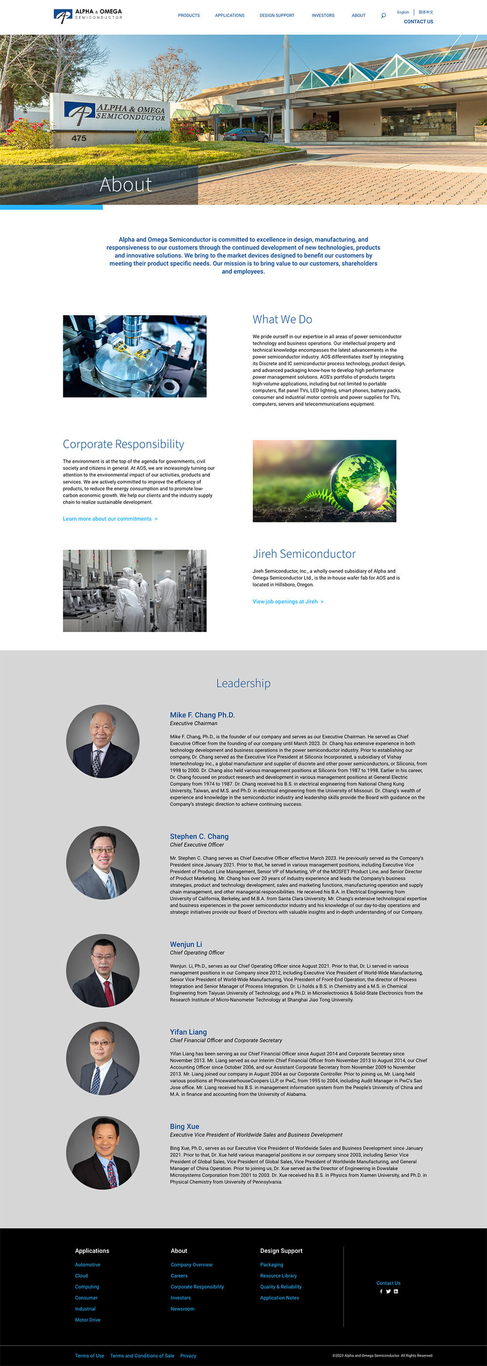
The Chronos UX team worked with AOS to design a site that featured the right blend of thought leadership messaging and engineer-focused product content.
The website was built with a headless Drupal 10 implementation, which maximizes performance and reliability while retaining all the strength of an established best-in-class CMS.
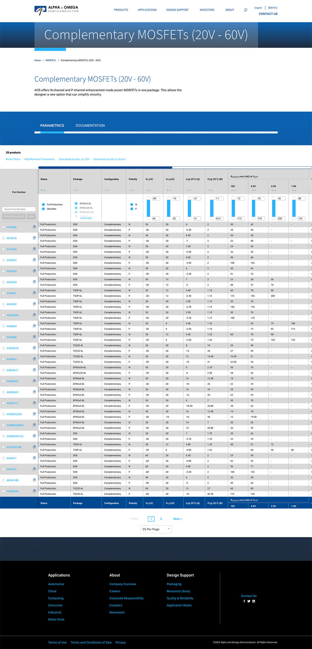
A critical success factor for the new website was creating efficient pathways for engineers to identify the correct products for their needs among AOS's catalog of more than 2,000 unique products.
Chronos built a parametric search tool that supports more than 25 product categories and 155 specification values. Interactive filter and sort interfaces facilitate rapid product location, while an integration with AOS’s ERP platform allows product updates to flow seamlessly into the website.

Avery Brewing Co. wanted to redesign their website in order to better reflect their culture and product brands. They were looking for a site that would open Avery to the more casual beer drinker without alienating their craft enthusiast base. Equally as important to them was creating a robust filtering/search system that would help consumers find the correct beer for them, for every occasion.
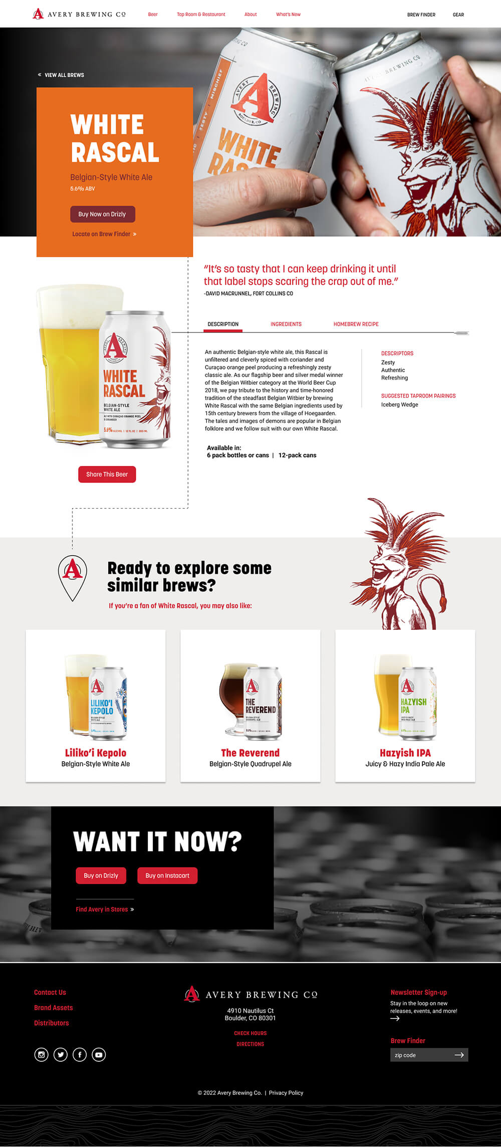
The new site builds on Avery's reputation as 'Curators of All Things Beer.’ It consists of approximately 400 pages of content, the majority of which are product pages dedicated to specific brews. Self-proclaimed 'beer geeks' are able to dig into the details of their favorite Avery beverage, while also getting suggestions for similar brews they may enjoy. Additionally, they can find the nearest location to purchase via the integrated Brew Finder tool.
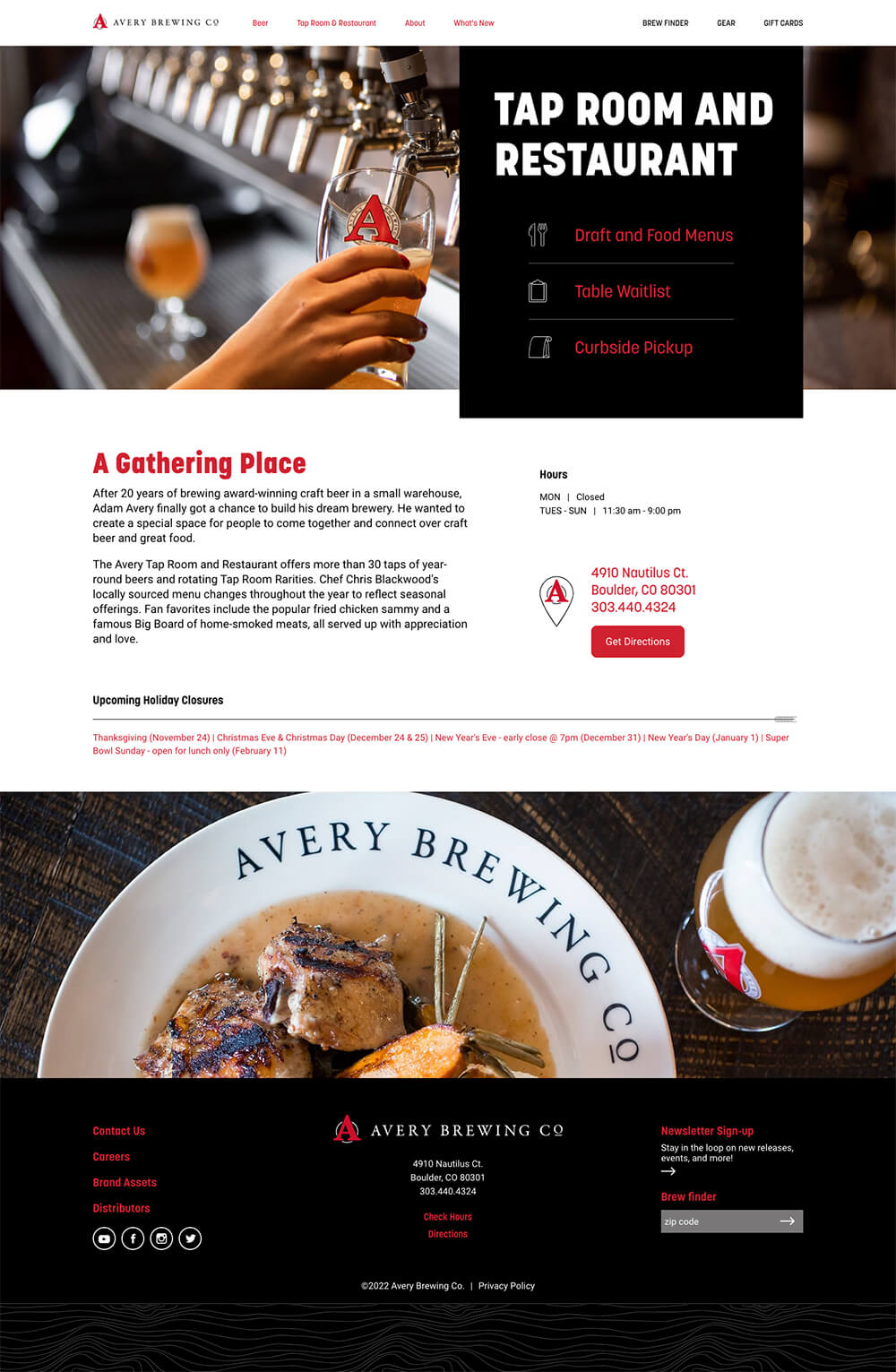
Another major push for the redesign was to give Avery's marketing team full access to update their site content, ever-changing taproom menu, and showcase their history and popularity in the microbrew space.
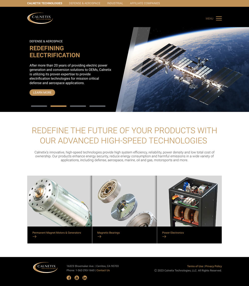
Calnetix is a dynamic company that creates industry-leading innovations in the field of high-speed rotational devices. Their commercial success has produced multiple subsidiaries over the past decade, and supporting this growth has required an engaged and committed partnership between Chronos and the Calnetix marketing team.

Most recently, Chronos worked closely with Calnetix to re-focus their website on two distinct audiences. This presented navigation, content, and UI/UX challenges. The new website successfully guides Defense & Aerospace industry visitors to appropriate content, while also supporting Calnetix’s traditional Industrial customer base.

The Calnetix site features rich interactive interfaces that deliver technical information to a diverse audience of engineers and executives. Chronos chose a headless CMS solution for the site build, with a Drupal 10 backend and a ReactJS frontend. A robust document library allows content managers to seamlessly control placement and categorization of downloadable documentation, integrated videos, and more.

Cupertino Electric, Inc. is a privately owned electrical engineering and construction company with nearly 4,000 employees across the nation. CEI wanted to use their website as a tool to attract the most talented engineers and managers, so they hired Chronos to design a site that would showcase their dynamic projects and unique culture.

Chronos worked closely with CEI’s recruiting and marketing teams to enhance their careers section. Our strategy team provided recommendations for compelling content and UI designers updated the site's visual elements to reflect CEI’s position as a leader in their industry. Additionally, a headless Drupal 10 solution was implemented to allow a seamless API integration with CEI’s job posting provider.
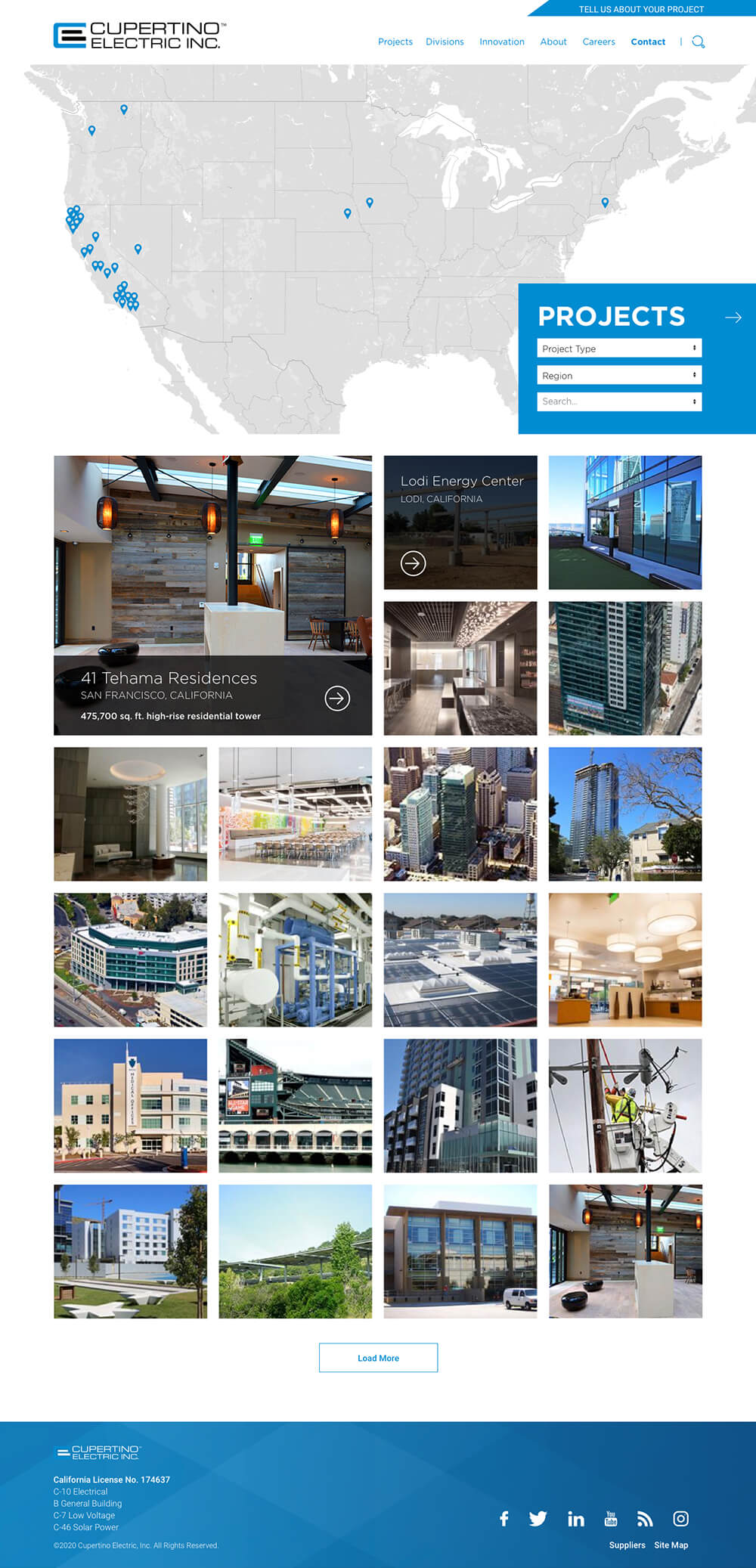
Equally import in attracting new talent (and new business) is showcasing CEI's work. CEI has an impressive—and extensive—portfolio of projects. Chronos designed a sortable, searchable project library that allows visitors to quickly target projects by region, industry, and keyword. Each project features 17 attributes, resulting in a highly structured, data-driven catalog of work.
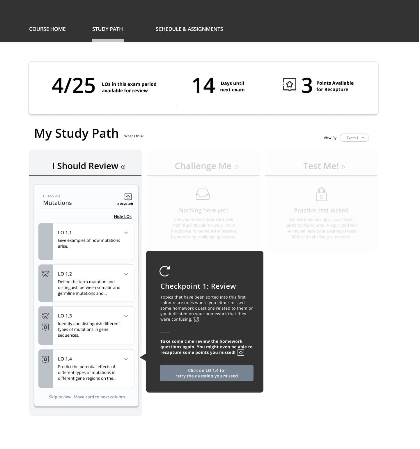
Codon Learning is an EdTech startup formed by educators to create a post-secondary teaching and learning platform for the STEM field. Their small core team is highly knowledgeable on educational pedagogy and technology, but needed assistance creating the blueprint for their new platform. Enter the Chronos UX team.
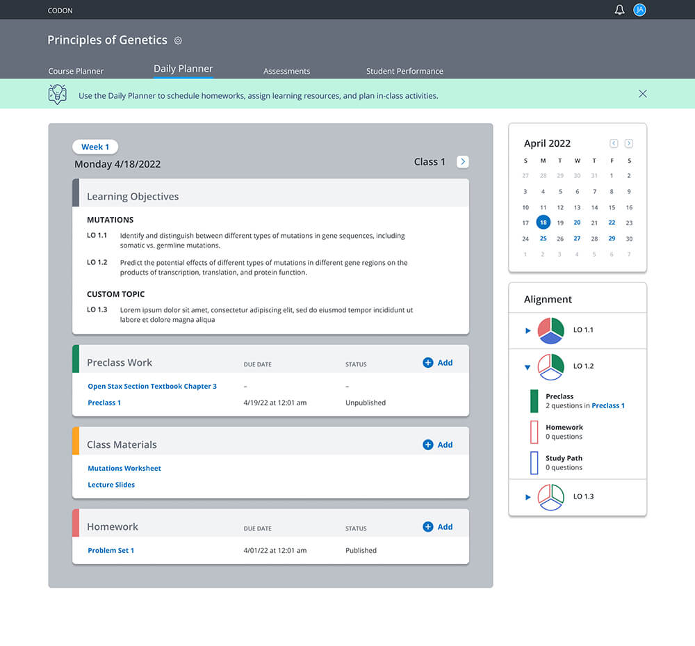
An engagement that was only supposed to last a few weeks became a years-long collaboration as Chronos and Codon worked together on design sprints, user flows, software architecture, high and low fidelity prototypes, user testing, and UI design. The resulting product, with dual instructor and student-facing applications, is now used in over 240 college-level STEM courses.

Temple Grandin is a renowned animal behaviorist, autism activist, and Colorado State University professor. To honor her work, CSU installed an exhibit dedicated to her in the Animal Sciences Building of their Fort Collins campus. Included in the exhibit is an interactive touchscreen display, designed and developed by Chronos.
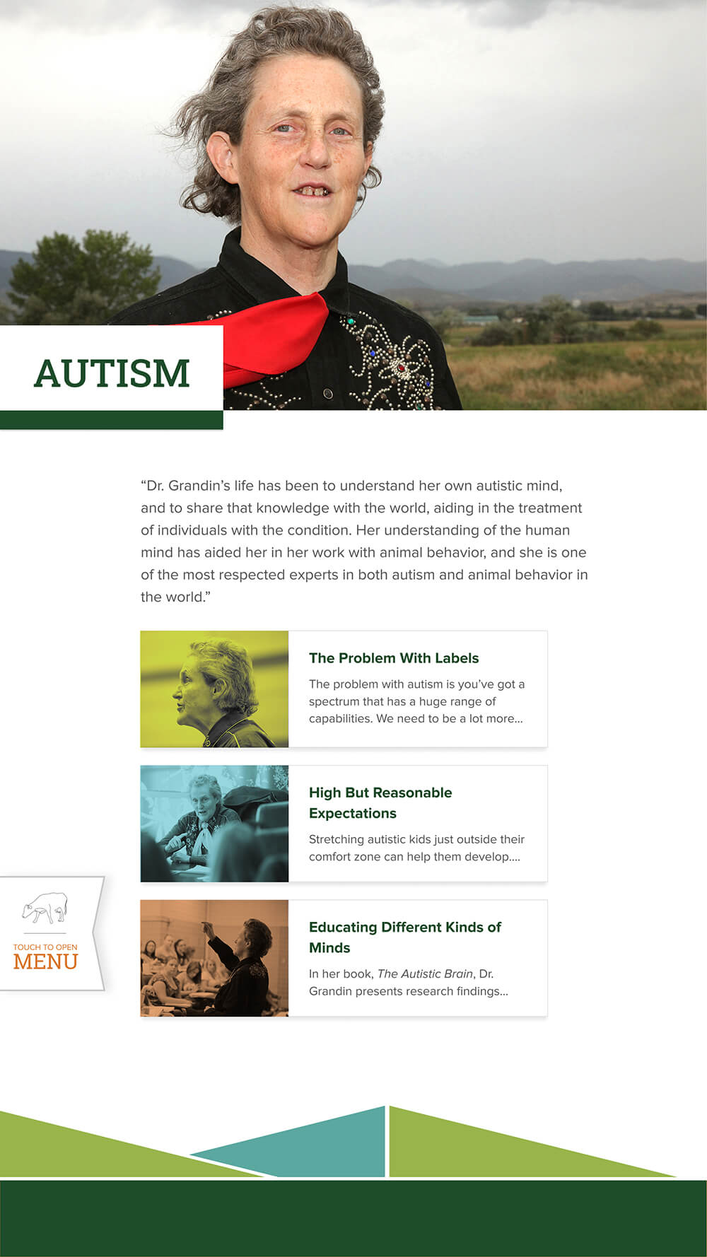
The display, an interactive biography of Grandin’s life and work, consists of images, videos, and other content provided by CSU. It is completely managed remotely through a robust content management system (CMS).
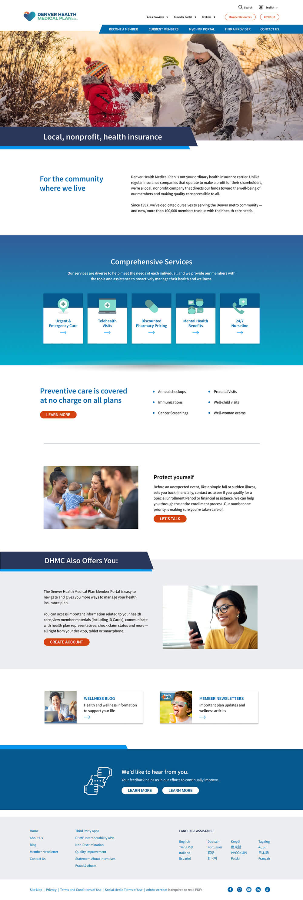
In 2022, Chronos began an iterative rebuild of the Denver Health Medical Plan website to improve the existing CMS and correct accessibility issues. The site was recently updated again to Drupal 10, significantly enhancing the client’s content management experience and capability.

DHMP is an ongoing client with whom Chronos continues to work, providing maintenance and enhancements to their site as needed. The Chronos UI/UX team is currently working with DHMP to revamp sections of the site in order to improve content organization, design, and accessibility.
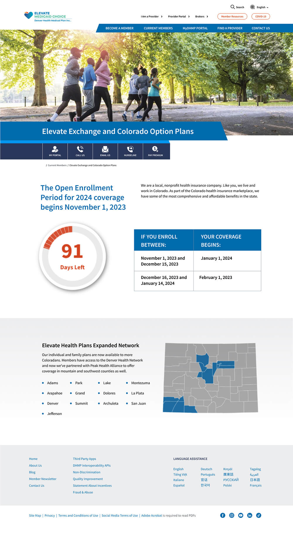
WCAG 2.1 compliance is a critical driver for DHMP, and in 2023 Chronos coordinated, managed, and implemented a transition from WAVE to SiteImprove to ensure optimal adherence to accessibility guidelines.
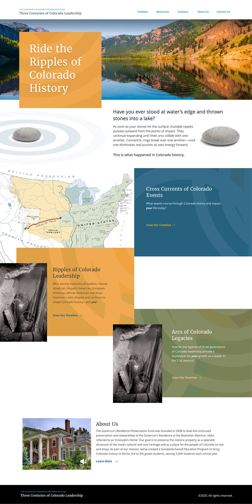
As stewards of cultural and civic heritage, the Governor's Residence Preservation Fund approached Chronos to create a microsite for Colorado students that highlights the state's history. They had a specific theme in mind: the ripples of events, leadership, and legacies over time that impact our lives today. Chronos worked within guidelines created by GRPF's art director to design a website that reflects this theme.
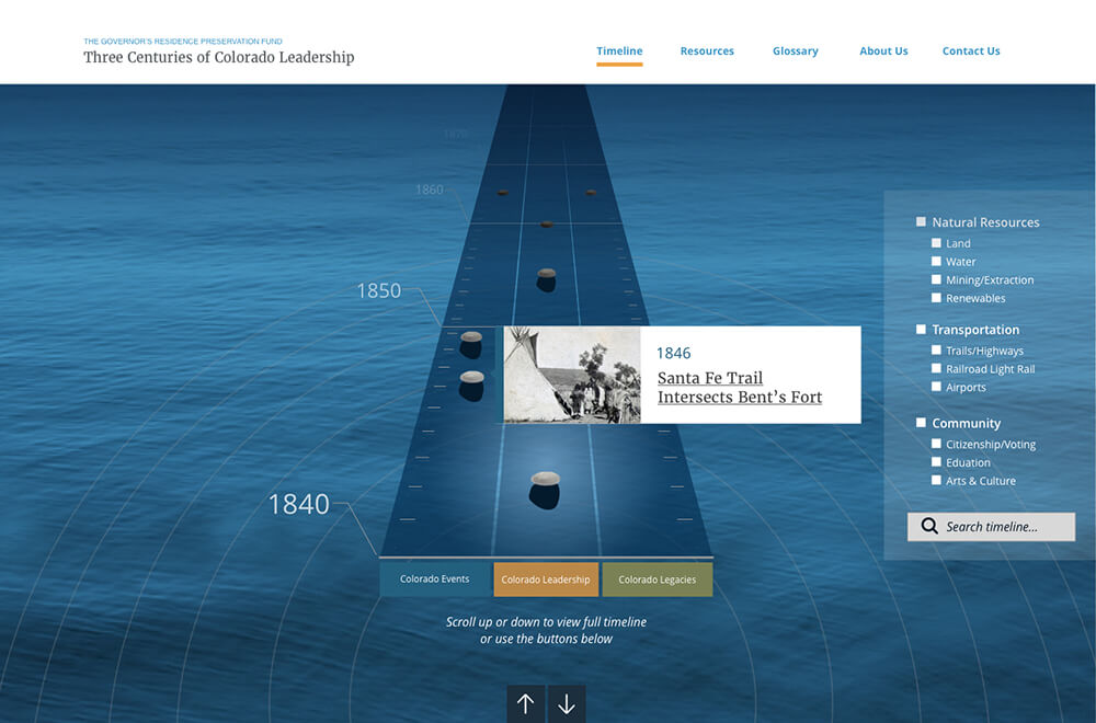
The backbone of the microsite is a rich interactive timeline that guides students along these ripples to investigate various events and personalities in Colorado's history. Included in the timeline are images, audio files and review questions and answers.
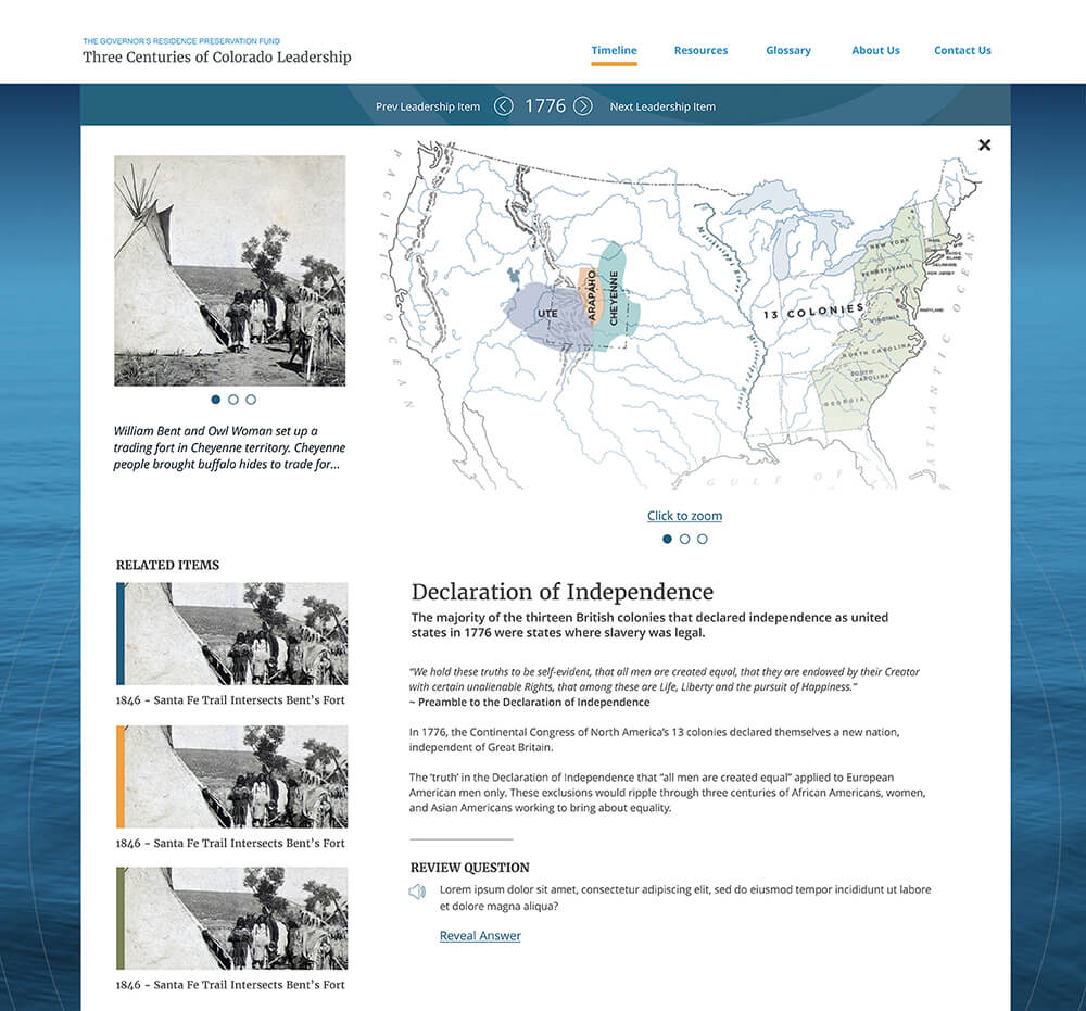
Despite the complexity of the highly interactive design, Chronos was able to integrate a Strapi CMS that allows content updates and edits to be made by members of GRPF's staff.

In collaboration, Chronos Interactive and [Spearca Communications](https://www.spearcadenver.com/) developed _Life. As Told By Youth_. (LATBY)—a digital platform that empowers Colorado's youth by providing a creative space to share personal stories through film. LATBY addresses critical issues faced by young people, such as strengthening relationships, managing sexual health, navigating parenthood, and overcoming poverty.

With its intuitive navigation and rich multimedia design, the website offers an immersive experience that highlights youth-driven storytelling. This engaging platform not only amplifies these essential messages but also builds meaningful connections between young creators and their audiences. By bringing these voices to the forefront, the LATBY website creates an impactful environment where youth perspectives are heard, valued, and shared with a broader community.

In early 2024, the Polyclinic Plastic Surgery Center underwent a strategic merger with Optum Health, emerging as Optum Plastic Surgery. To align with the brand identity of its new parent company, Optum enlisted [Hero Marketing](https://www.heromarketing.com/)—an established collaborator of Chronos—to develop a cohesive visual brand language for the clinic. To bring this vision to life digitally, Hero engaged the Chronos UX team, tasking them with translating the brand's aesthetic into a dynamic, modular website.

Initially, we focused on building a comprehensive design system. Guided by Hero’s design concepts, the Chronos team began by developing a responsive typographical system that maintained readability and style across multiple screen sizes. Following this, a carefully curated color palette was established, meeting WCAG accessibility standards. Spacing guidelines were then implemented to bring structure and visual clarity to each layout. Finally, a robust library of UI elements—including buttons, links, and navigation components—was created, with distinct states defined for each.

Building on these foundational elements, Chronos designed a comprehensive library of modular, responsive content components. This modular approach enabled the team to rapidly produce a variety of unique page layouts by combining elements like image galleries, testimonials, service highlights, and call-to-action sections. The result was a scalable design system that could accommodate future content needs and updates efficiently, ensuring that every page felt cohesive and visually appealing across all devices.
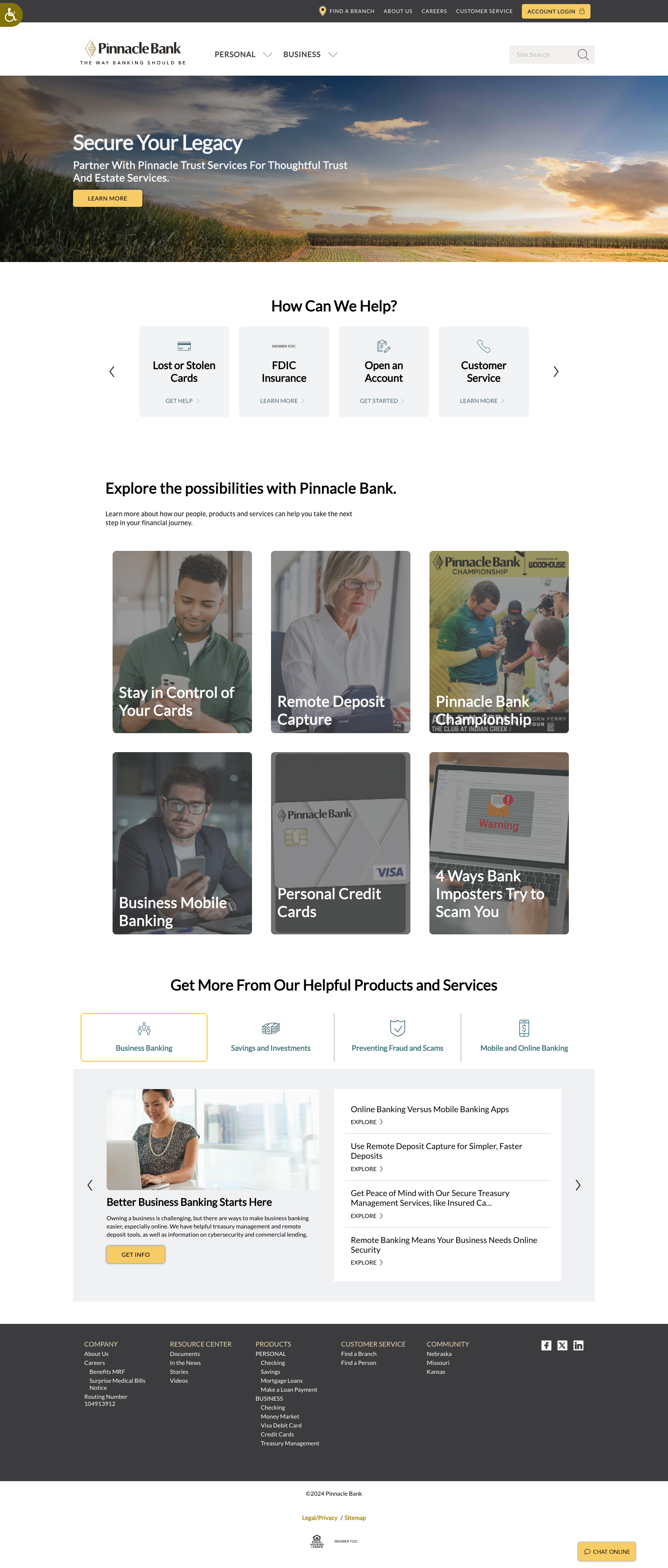
Pinnacle Bank is a leading regional bank, and they need their six state charter websites to be managed from a single unified Content Management System. Chronos works closely with our long-term marketing partner, [Karsh Hagan](https://karshhagan.com/), to maintain and constantly improve these sites. Enhanced content, intuitive tools, and improved UI/UX design have resulted in measurable improvements in visitor engagement and website utilization.
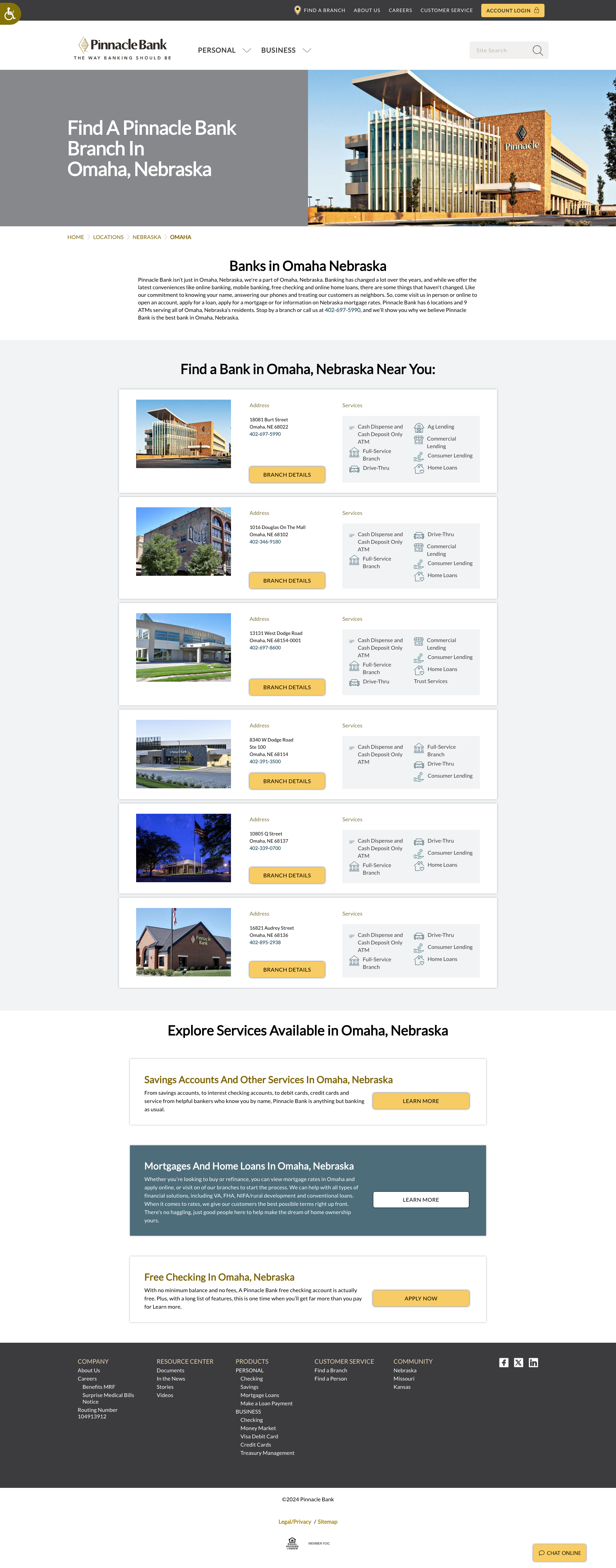
As a regional bank, Pinnacle needs to ensure its customers have access to the same tools offered by larger national institutions. Using Google Maps API and Pinnacle’s database of branch information, Chronos built an interactive map that allows bank members to quickly search and locate branches across all states serviced by Pinnacle.
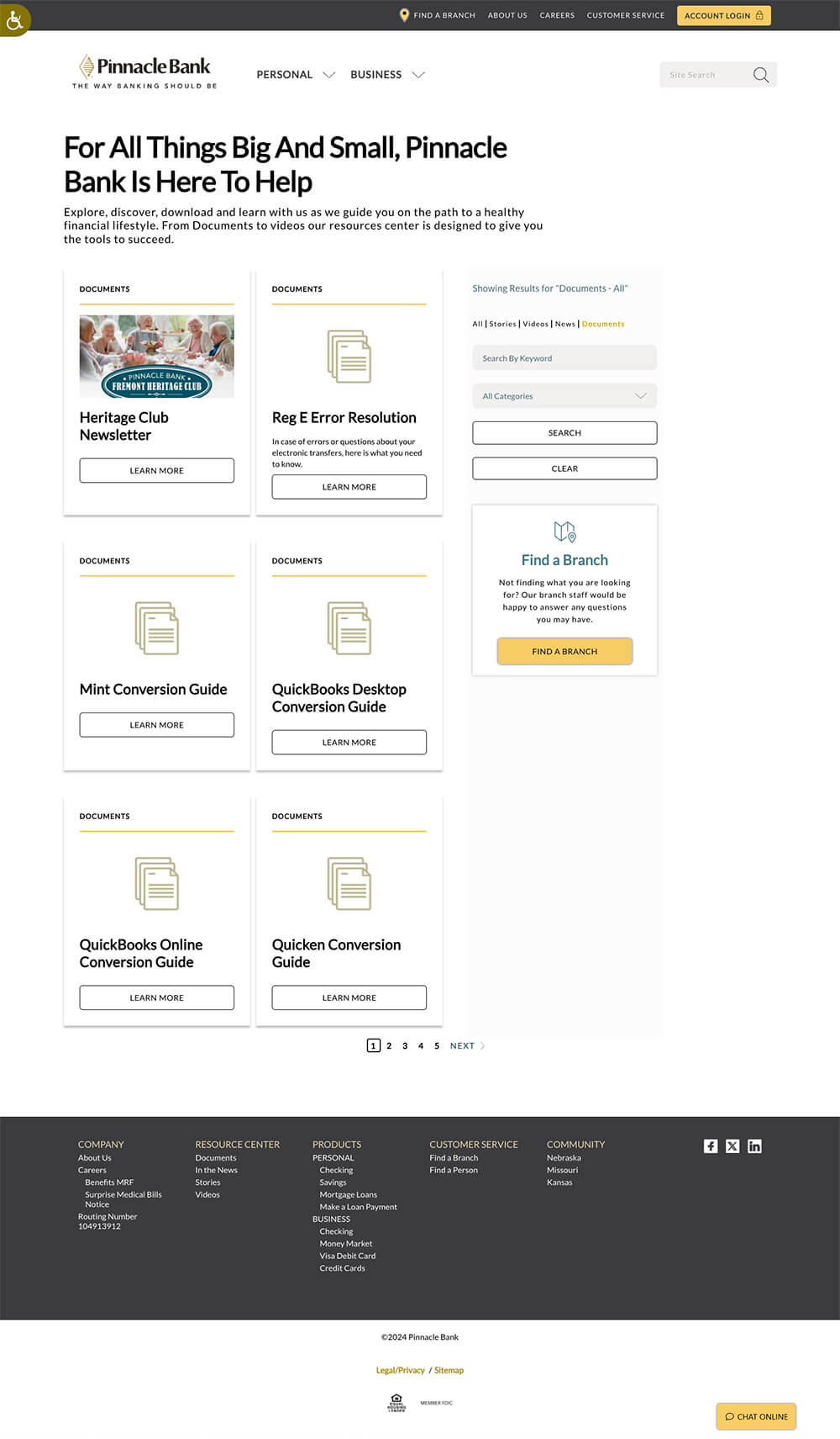
Efficiency is key for a site that utilizes one CMS across multiple domains. The Pinnacle Bank education center is evidence of this—a robust library of financial resources for bank members in multiple states that is managed in one central location.

A major player in the cloud-based cyber security industry, Proofpoint has been a long-term partner with Chronos. We work closely every day with Proofpoint’s dynamic digital marketing team to improve their site, from the user interface to the nuances of server performance, and everything in between.

Most recently, Chronos has been working closely with an external design firm to redesign the site in sections. Starting with the homepage, navigation, products and solutions. The design and development is first-class led by a team of project managers and thoughtful architecture solutions managers.

A long-term partner, SiTime has grown significantly as a company, vastly expanding their products and developing a full eCommerce solution, under the guidance and expertise from Chronos. We are extremely proud of our work with this team.
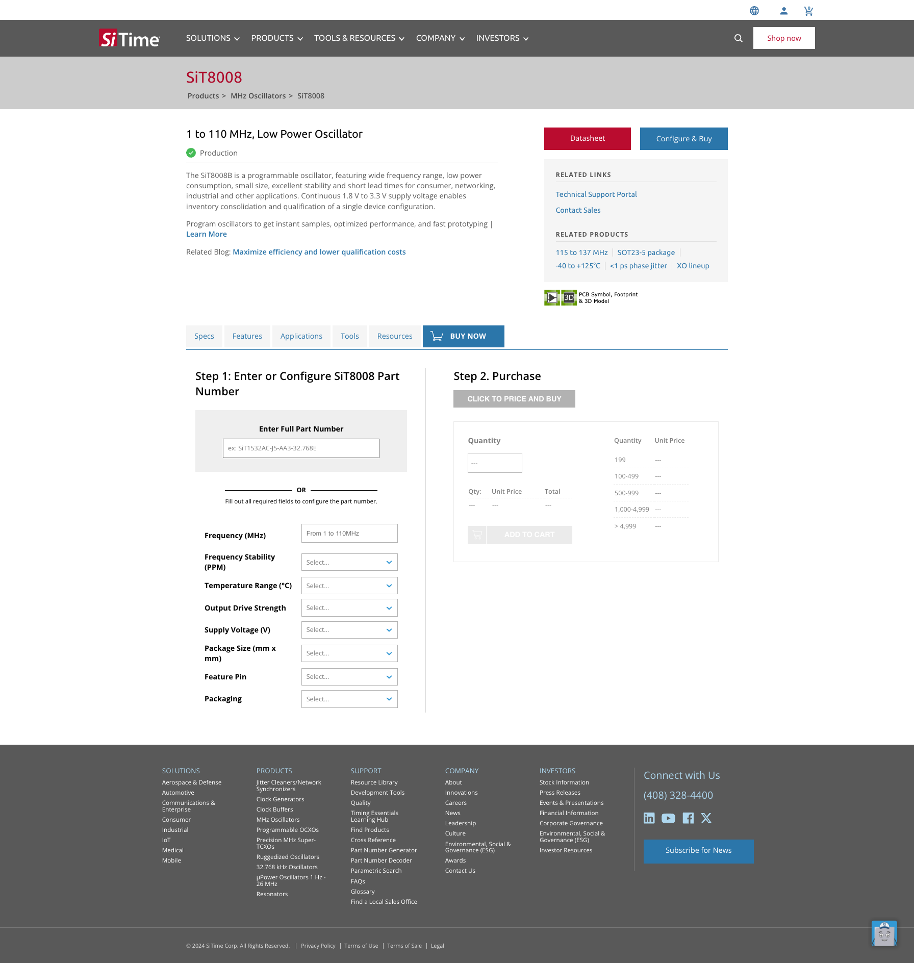
From enhancing the user experience, to improving the tools used by their customers, Chronos has worked with SiTime's internal marketing and business solutions teams to grow their Drupal-based website. Most recent projects include implementing WCAG compliance, reconfiguring the part number generator, along with a full redesign of their product pages, menu, and newsroom.

A major solution recently developed is their parametric search, which includes a full backend database managed by their internal team. Their previous solution was entirely spreadsheet driven, and their new backend solution is a cloud-based database that merges their datasets into a unified structure.

SKYDEX is in the business of protecting people. Their patented, polymer-based geometries absorb energy to enhance comfort, shield from impact, and lessen vibration-related fatigue. The core of their business has always been the U.S. military, but when they decided to expand into more commercial applications they turned to Chronos for help revamping their website to match their new business goals.

The first step was amending content, messaging, and information architecture. Chronos’ digital strategy team helped pivot the new site from a primary focus on the military to demonstrating the application of SKYDEX technology across a wide variety of industries. New brand guidelines provided by SKYDEX’s external marketing agency were used by the Chronos design team to produce a vibrant, human-centered website design.

Many websites have a variety of pages that rarely change, along with highly dynamic areas subject to frequent updates and content growth. By isolating and hard-coding these rarely updated "bespoke" pages, Chronos was able to reduce costs and enhance rich interaction of critical messaging. Meanwhile, SKYDEX's marketing team has a mature CMS, which gives them full control to edit case studies, news articles, and careers. Chronos also designed a library of reusable content blocks, which allows the SKYDEX team to build new product pages as needed.

Chronos prides itself on long-term relationships with our clients. We view ourselves as extensions of their teams and step in to collaborate on projects in whatever capacity is necessary. In the case of Swift Navigation, this meant pairing our developers with their internal marketing and design team to produce a Drupal 9 headless website and an eCommerce solution (Shopify).

Chronos has an ongoing engagement with the Swift marketing team to prioritize ongoing redesigns and enhancements. Most recently this included a full rebuild of the home page, blog, and newsroom, along with a Drupal 10 upgrade.

Upwing Energy, a California-based gas-tech and service company, is an innovator in the industry of low-emission intensity natural gas production. They needed a website that would cultivate enthusiasm for their technology in two diverse audiences—investors and risk-averse engineers.

Chronos built Upwing a dynamic, modular website with a richly interactive homepage. Decoupling the CMS from the front-end gave our dev team the freedom to flex their creative muscles, while still allowing Upwing's marketing team to utilize the mature and robust Drupal CMS.
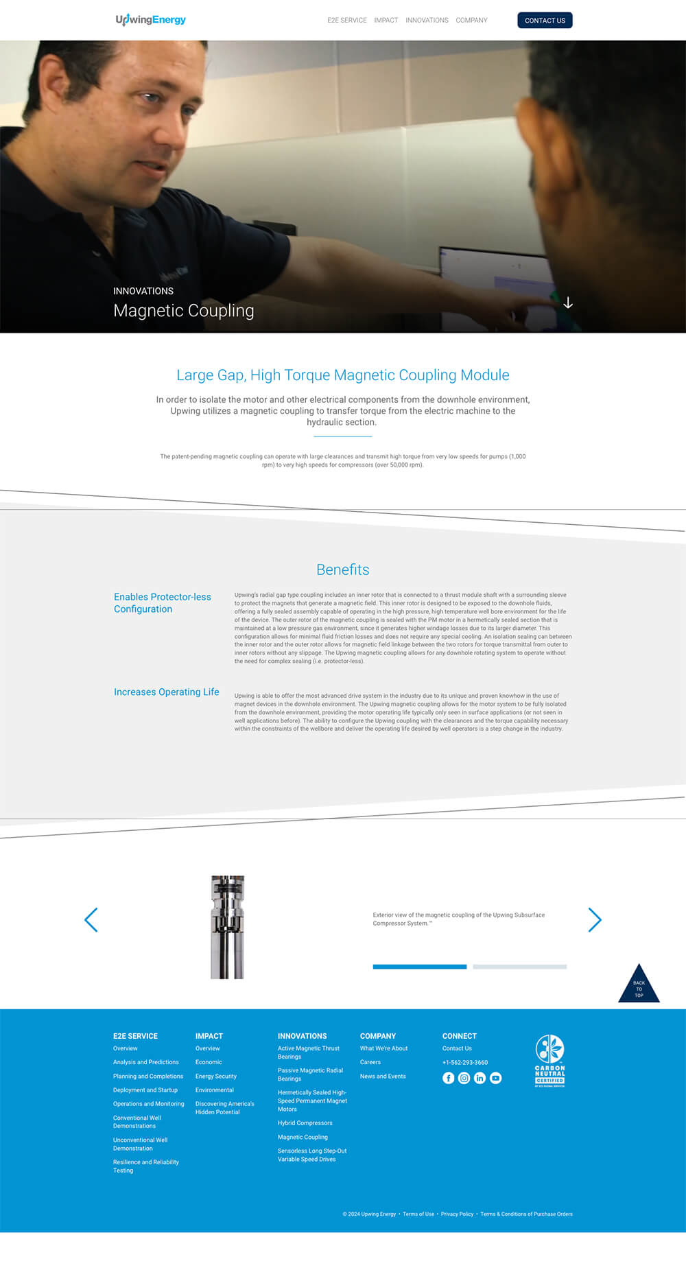
Upwing’s website also highlights the flexibility a modular website can provide, displaying large amounts of content in visually appealing designs. Chronos continues to partner with Upwing's internal marketing team on content, site architecture, design, SEO, and development.
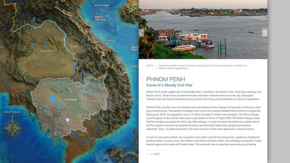
Chronos partnered with the USAFA Association of Graduates and the Class of 1970 to design a series of kiosks at their newly constructed Southeast Asia Memorial Pavilion. The interactive maps and timelines guide visitors to explore important locations in Southeast Asia and follow a timeline of major air operations during the period of 1946 to 1977.
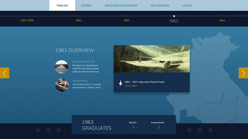
The goal of the project was to preserve the stories of the graduates who participated in the Southeast Asia operations and honor the heritage for future generations of cadets.
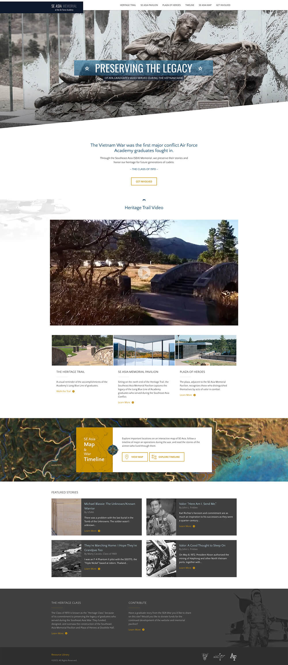
The kiosks were so well received the client then commissioned Chronos to design a website that would offer the same content to those who were not able to visit the SEA Pavilion in person. The site also allows visitors to submit their own stories of a family member or friend who served.
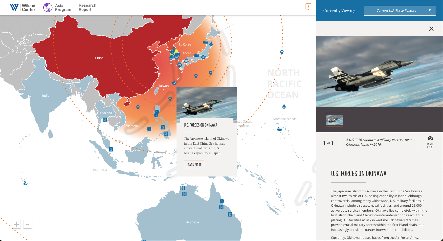
The Wilson Center required a web-based interactive map with various graphical elements to showcase key research findings on the Indo-Pacific region in an engaging way. The rich interactive map includes multiple clickable hotspots that provide detailed information and media, allowing users to zoom and drag the map.
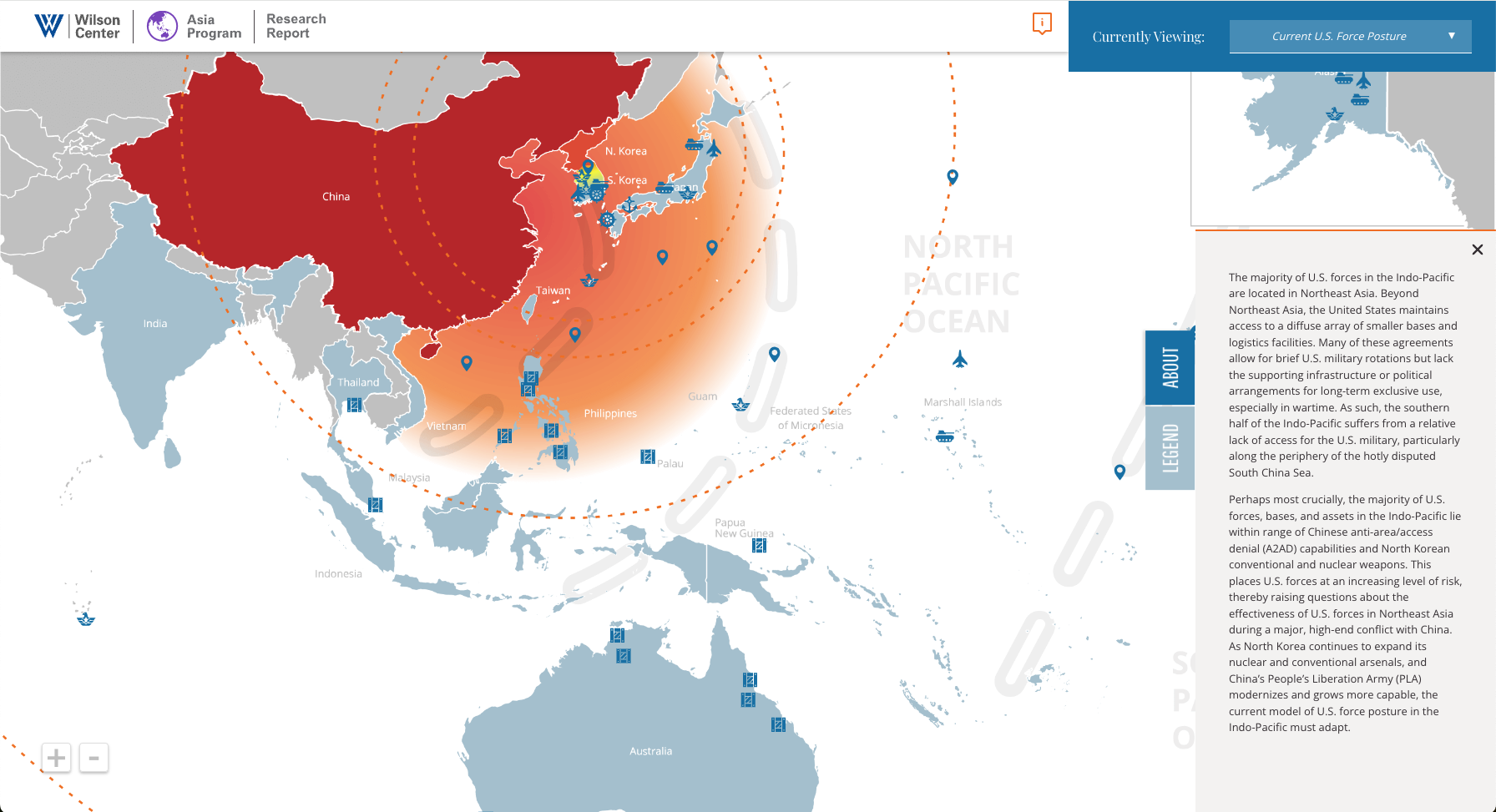
The map also integrates multiple layers of information in a user-friendly manner, aiding understanding of US defense positioning and supporting the associated research report.